Power Bi’s traditional bar charts & standard chart options often restrict you in effectively communicating key data insights. Error bars customization opens up a new dimension of visualizations, enabling you to create unique and informative visualizations.
Primarily Error Bars allow you to track uncertainties in your data sets, recently Microsoft has added some custom elements into it, these enhancements have transformed error bars into a powerful tool to create new chart types – all this is possible without relying on the additional custom visuals.
This blog will guide you exploring four unique chart variations that you can create entirely within Power BI using error bars, without relying on additional custom visuals.
- Lollipop Chart
- Dumbbell Chart
- Two toned Lipstick Chart
- Lollipop & Bar Combo Chart
These creative visualizations add a touch of fun and enhance clarity & audience engagement.
By the end of this 5 mins read you will be able to create, 4 unique charts using error bars as shown on the dashboard..
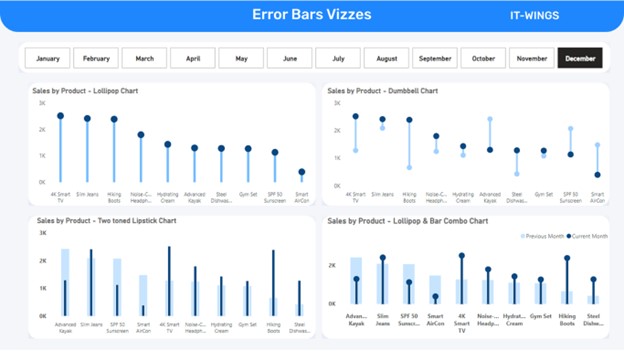
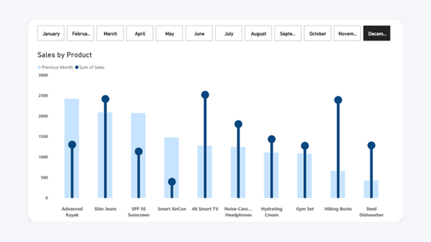
Chart 1 - Lollipop Chart
Lollipop charts offer a creative way to present your data, making it more dynamic & engaging compared to traditional bar and line charts. The lollipop chart comprises two major components, Circles & line(stick). Circles at the end of the lines represent data values, while lines connect the circle & x-axis ensuring precise data representation.
6 Steps to create Lollipop Chart
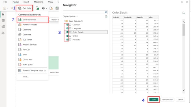
Step 1: Importing Dataset
Let’s begin the process by importing appropriate dataset into Power BI. We will be working with a sample dataset consisting of sales statistics of different products. Following these steps you will be able to create interactive lollipop chart that is completely dynamic and adjusts to slicers and filters within your report.
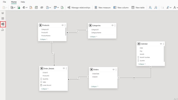
Step 2 - Data Model Validation
After importing dataset, it’s crucial to validate the data model’s relationship created by power bi automatically.
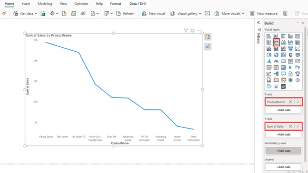
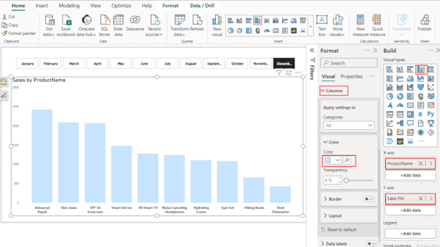
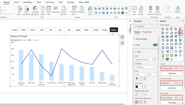
Step 3 Creating Line Chart
To create a Lollipop Chart, we proceed by creating a Line Chart as it is the foundation.
Navigate to the visualization pane and select line charts from the visuals, Add data fields to it, in our case we will add Sales to Y-Axis fields & ProductName to the X-Axis. We will get a standard line chart. We will further customize it to create the Lollipop Chart.
Step 4 Transitioning into Lollipop Chart
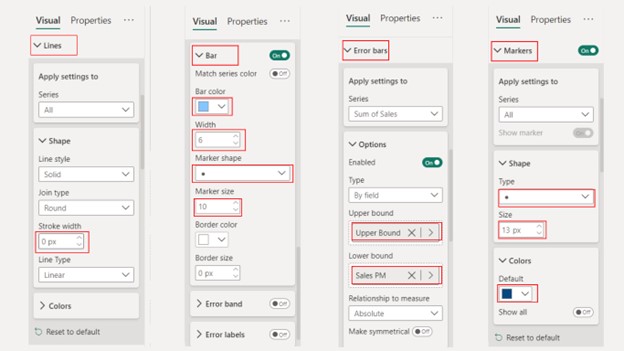
Let’s transform our traditional line chart into Lollipop by customizing error bars & markers. This chart is combination of two critical components (Error Bars & Markers).
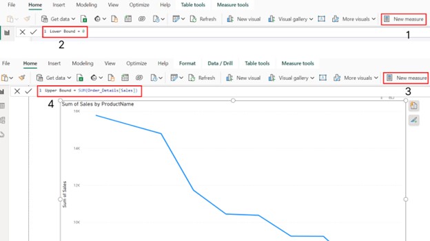
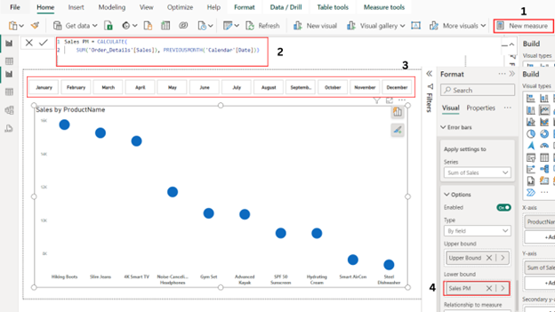
Create New Measures:
- Navigate to the ‘New Measures’ option and create upper & lower bounds measures.
- Define the upper bound as your sales value.
- Define the lower bound as zero.
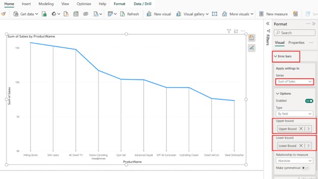
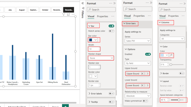
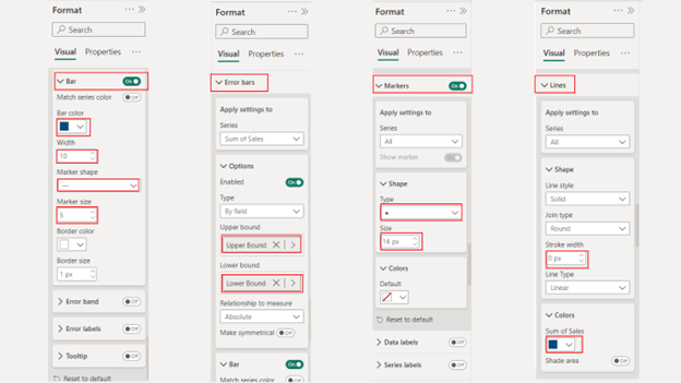
Error Bars (Stick):
- Navigate to the formatting pane, Select the error bar options.
- Now Drag upper bound measures in the upper bound field(this step creates the stick) field
- Drag lower bound measure accordingly(this acts as the starting point of the stick at the baseline).
Step 5: Fine-Tuning & Customization of the Lollipop Chart
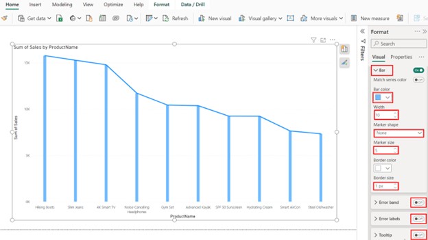
Bar Visuals:
- Adjust the thickness of the lollipop sticks by adjusting the width of error bars.
- In the bar Visuals settings, set the marker shape to “None” and increase the width to 10px (creates the thin stick).
- In the line settings, set the stroke width to zero (hides the line).
- Turn off Error Bands, Error Labels & Tooltips.
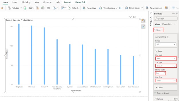
Line Visuals
In the line visual settings, set the stroke width to zero( this will hide the line completely).
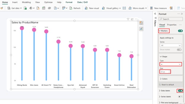
Markers (Candy)
We will use Markers to form the ‘Candy’ Portion of our lollipop. To make them visible & distinct, increase its size.
- Navigate to the formatting pane, Select the Error bar options
- Change the shape of the Markers to “Circle”
- Increase the Size of the Marker to 20 px to make the Candy pop & shiny
- Turn on Data Labels
- Choose appropriate color, we will choose a bright color like pink for circular markers
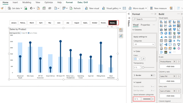
Step 6 Additional Formatting:
- Disable tooltips, error bands, and error labels to get a cleaner look and focused chart.
- Remove y-axis and x-axis titles to avoid the clutter.
- Fine tune-your graph by adjusting by turning off default gridlines, this will result in a more focused chart.
- Modify the default Chart Title if required.
Finally, you get a playful dynamic lollipop chart without using the custom visuals in Power Bi.
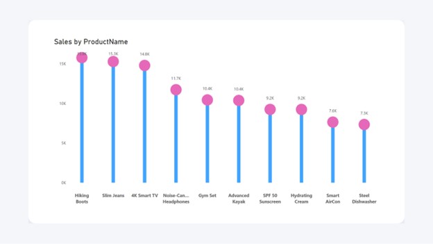
Chart 2 - Dumbbell Chart
Next up, we will create the dumbbell chart. This is a variation of a typical bar chart with two extending bars from a central point, representing a distinct data point within the category. It visually compares magnitude and direction of two related data points for each category.
3 Steps to Create Dumbbell Chart
Step 1 Create New Measure & Date Slicer
Let’s create a new measure called “Sales Previous Month”, this will represent a lower bound in the error bar. This measure will calculate the sales for the preceding month. Also add a Date Slicer by Month to your report as shown below.
Step 2 Duplicate and Customize
To speed-up the process you need to copy the lollipop chart we created earlier and do following modifications to it. Modify the error bar settings to use “Sales Previous Month” as the lower bound.
Step 3 Visual Customization
Error Bars: Navigate to Error Bars set upper bound & lower bound.
Markers: Reintroduce the marker for better visibility and set its size to 13 px. Adjust the marker size and color as dark blue to distinguish it from the current sales value.
Bar: Navigate to ‘Bar’ & set bar color to a light shade blue, set marker shape to circle or dot and size to 10px , this represent Previous Month Sales.
Lines: Navigate to ‘Lines’, set Stroke Width to 0px.
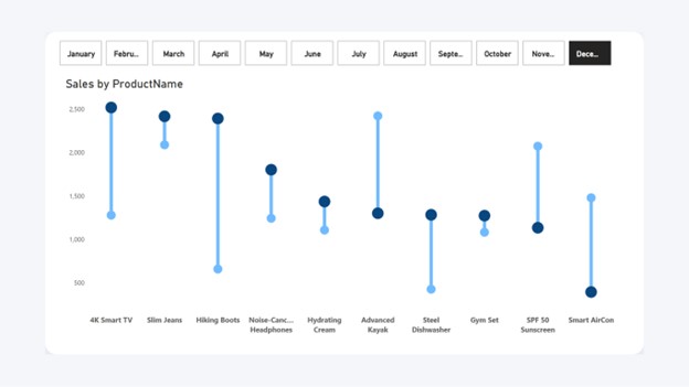
Dark Blue represents the Current Month Sales, Light blue represents the sales trend & magnitude of sales for the previous month.
Now you have a dynamic dumbbell chart showcasing the difference between current and previous month sales(December & November sales are compared in above example). Due to certain limitations it is recommended to disable the data labels & enable Y-axis for clarity & better readability.
Chart 3 - Two Toned Lipstick Chart (Advance Bar Chart)
This chart isn’t a standard chart type available in Power Bi, but it can be built on a regular column chart to represent two data points for different categories or same category but different time intervals. It comprises a wide column at the back and a narrow column at the front which you can create by error bars.
Two toned chart is useful for comparing two data metrics, offering intuitive and concise visualization than using separate bars
3 Steps to create this Chart
Step 1: Duplicate existing chart
To speed-up the process lets copy the existing lollipop chart and initially convert it into a bar chart.
Step 2: Stacking Bars by Selecting Stacked Bar Chart
In this approach you will use two bars
Back Bar: A back bar representing previous month sales. Set “Sales Previous Month” on the Y-axis (back bar), Customize the back bar by making it gray and make it wider to indicate it’s the previous month’s value. Reduce the back bar’s thickness by increasing column padding.
Front Bar: A front bar for current month sales. Set “Sales” on the line axis (front bar). Enable error bars with “Sales” as the upper bound and “Base” (0) as the lower bound. Make this bar a dark shade and narrow to represent current month sales.
At last remove the marker, and adjust its width and border size.
Step 3: Formatting Visual
Column: Navigate to columns, increase space between categories & choose a light blue shade to represent previous month sales.
Error Bars: Set Upper Bounds & Lower Bound to calculated measures.
Bars: Choose a dark blue shade, and set width to 10px, marker shape to “None”
Choose the appropriate month whose sales would you like to compare to previous month sales
In the below example, the dark shade represents Sales for the Month of December & the light tone represents the sales for November.
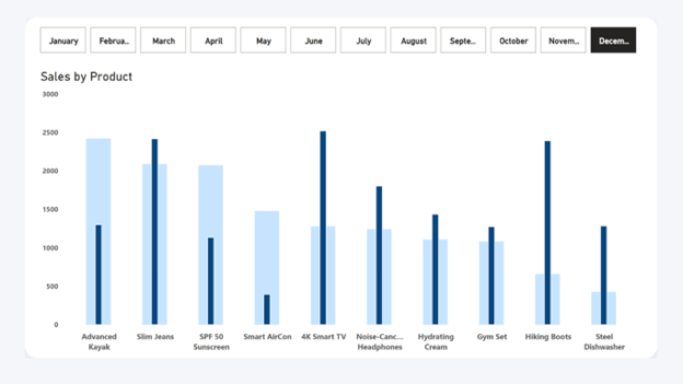
Now you have a lipstick chart that dynamically portrays current vs. previous month sales based on your slicers.
Chart 4 - Lollipop & Bar Combo Chart
This chart refers to combining a lollipop chart & a bar chart to create this combo chart. This chart compares two data metrics. In this current scenario you can use the lollipop chart to emphasize on the current month sales, while the bar chart at the back provides context for the highlighted sales by providing sales for the previous month.
3 Steps to Create in Power BI
Step 1: Duplicate & Modify
This chart refers to combining a lollipop chart & a bar chart to create this combo chart. This chart compares two data metrics. In this current scenario you can use the lollipop chart to emphasize on the current month sales, while the bar chart at the back provides context for the highlighted sales by providing sales for the previous month.
Step 2: Formatting Visual
Bar: Turn on Bars, Select a dark shade blue, increase width to 10px, and increase marker size to 5 px.
Error Bars: Set upper bound and lower bounds to already created columns.
Markers: Turn on markers, set type to dot or circle, Increase size to 14px.
Lines: Reduce stroke width to zero and select dark shade blue.
Columns: Finally navigate to space between categories and increase its size to 54px, set color to light blue.
Now select the Month, the graph will dynamically compare its values with the previous month.
You’ve created a combo chart with lollipops for current sales data points and a bar chart in the background showcasing previous month sales. This chart also interacts with your slicers and filters.
Final Thoughts
Finally, you have explored chart-building with error bars in Power BI. With a dash of creativity and an understanding of the technical aspects, you can transform error bars from a simple uncertainty tool into a powerful instrument for creating dynamic visualizations that will leave a lasting impression on your audience & stakeholders.
FAQs
Yes there are Third-party options available, you can find custom visuals like Lollipop Bar chart or Lollipop Column Chart that can create these charts. However, these visuals require installation & there might be licensing requirements.
Not at all! The beauty lies in crafting them entirely within Power BI using built-in error bars and formatting tools.
Absolutely! The blog post just opens the door. Experimentation with error bars allows you to explore numerous unique chart variations.
Data Label Positioning might encounter some issues. Consider disabling them specially in dumbbell charts and using the Y-axis for value reference. Wider error bars can consume space, especially in charts with limited space.
LINKS
Embed code:
<iframe title=”IT-Wings Error Bars” width=”600″ height=”373.5″ src=”https://app.powerbi.com/view?r=eyJrIjoiMGUxYWRjNWEtYmFiNS00ZWQwLTlhOWQtYTYzY2M4ZDM3NDM2IiwidCI6ImRmODY3OWNkLWE4MGUtNDVkOC05OWFjLWM4M2VkN2ZmOTVhMCJ9″ frameborder=”0″ allowFullScreen=”true”></iframe>