
Creating visually appealing reports inside Power BI doesn’t always need to be developed using complex custom visuals. You can develop complex visuals using standard features within Power BI Desktop to develop visuals with far more flexibility & use-cases compared to custom visuals, including the development of this donut chart. This article will be highly useful for those who often rely on custom visual solutions for seemingly high-end visualizations in Power BI.
To create a donut chart in Power BI without using custom visuals, you need to create measures according to your data model. Next, create a basic donut chart and apply created measures to visualize the data accordingly. Next, enhance the visual appeal of your chart by formatting and aligning the donut charts to the center and middle of your report for a balanced layout. Finally, to improve clarity add additional visuals & interactive elements to complement data in your donut chart.
Why do you need to use built-in tools? Using built-in tools reduces dependencies on external plugins that might complicate deployment or create performance issues.
In this article you will learn how to generate this donut charts using the built-in functionalities of Power BI, even if you don’t have access to premium or third-party visual components you can still develop compelling reports.
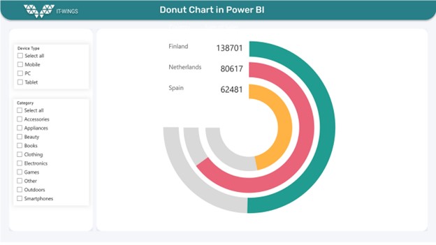
This donut chart will visualize & track sales, compared to sales targets for a specific country.
11 Steps to Create Above Donut Charts in Power BI
1. Prepare Your Dataset
Load your dataset into Power BI, Navigate to Get Data or Click on Excel Workbook, you will be directed to select the file, next click on Load-to-Load data inside power Bi.
For this scenario this will include fields like country, sales for retail sales.
This content is locked
Login To Unlock The Content!